Seat map redesign
Design Challenge: Redesign the seat selection process on alaskaair.com to be tablet-friendly and accessible.
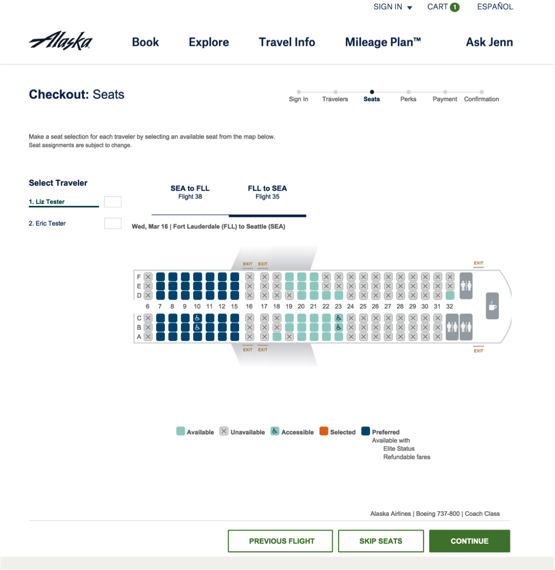
Background Research: This design work originated following a usability study I ran on the alaskaair.com booking path using tablets. Some of the users on both iPad and Android tablets experienced difficulty with seat selection. Sometimes they had to pinch to zoom while other times the operating system would zoom for them because the tablet couldn't tell which seat they meant.
Accessibility Considerations: Through alaskaair.com's evaluation by an accessibility vendor and my personal experience using a sceren reader, I also acknowledged that the seat map was challenging to use with assistive technology.
I worked through a number of design decisions across multiple teams, including the following:
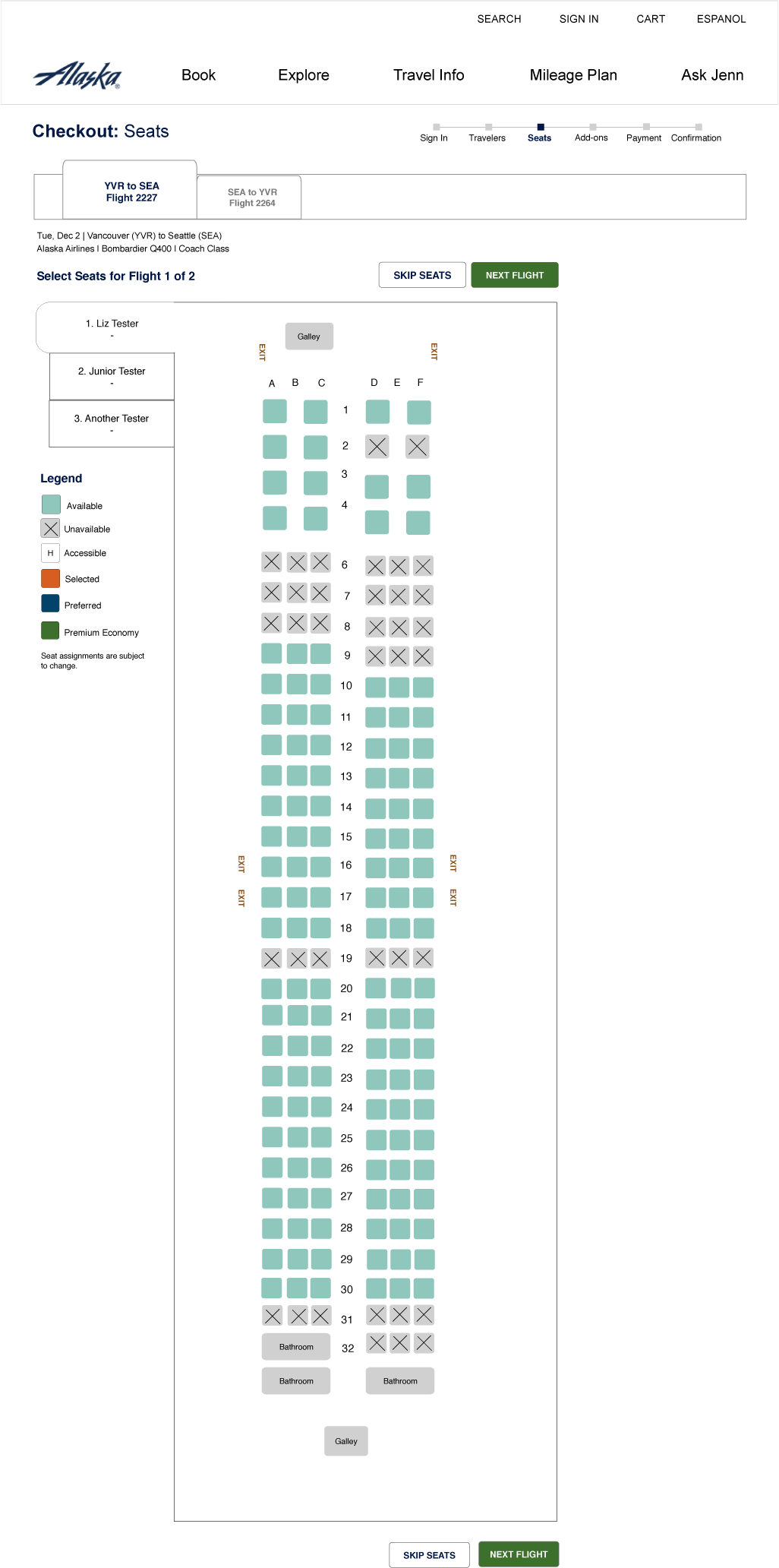
- I re-oriented the seat map to be vertical, so that as you navigate through, you traverse from front to back, row by row, in a logical way. This also allows for the seat map to be larger, easier to use on tablets, and use the natural scroll of the page rather than sometimes scrolling from left to right.
- I worked with graphic design to come up with iconography to accompany the use of color to identify seats.
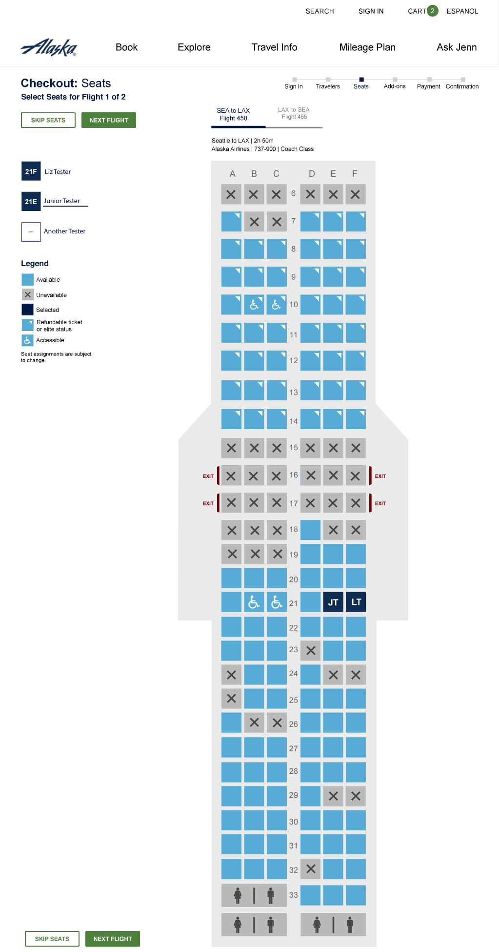
- When you scroll down, you can tell which seat you are on because the column headers are fixed at the top of the page.
- As you select seats, the initials of the traveler appear in the seat. This is easier to understand than cross-referencing numbers back to the list of traveler names. Screen reader users have a recap announced of what just happened, followed by the context for the next step.
- A developer with assistive technology expertise helped guide implementation decisions such as using a tab panel for selecting the current traveler.
Before redesign:
Initial draft:
Final design:
Through collaboration with visual design
Usability research:
In order to validate the design and assist in iconography choices, we ran several usability studies.